CS 180 Project 2: Fun with Filters and Frequencies!
Fun with Filters
This section focuses on 2D convolutions and filtering. We begin with the humble finite differences:
\[ D_x = \begin{bmatrix} 1 & 0 & -1 \end{bmatrix}, \quad D_y = \begin{bmatrix} 1 \\ 0 \\ -1 \end{bmatrix} \]
applied to sample images.
Convolutions from Scratch
We implement convolution from scratch in two ways:
- Four nested loops
- Two nested loops with vectorized region operations
def convolve_a(image, kernel):
    H, W = image.shape
    h, w = kernel.shape
    pad_h, pad_w = h // 2, w // 2
    padded_image = np.pad(image, ((pad_h, pad_h), (pad_w, pad_w)))
    output = np.zeros_like(image)
    for i in range(H):
        for j in range(W):
            result = 0.0
            for m in range(h):
                for n in range(w):
                    result += padded_image[i + m, j + n] * kernel[m, n]
            output[i, j] = result
    return output
and
def convolve_b(image, kernel):
    H, W = image.shape
    h, w = kernel.shape
    pad_h, pad_w = h // 2, w // 2
    padded_image = np.pad(image, ((pad_h, pad_h), (pad_w, pad_w)))
    output = np.zeros_like(image)
    for i in range(H):
        for j in range(W):
            region = padded_image[i:i + h, j:j + w]
            output[i, j] = np.sum(region * kernel)
    return output
In some sense, the second implementation is better because it takes advantage of vectorized operations, which are more In some sense, the second convolution implementation is better because it takes advantage of vectorized operations, which are more memory-efficient and can benefit from parallel execution. However, since the images we are working with are not very large, the difference in runtime is negligible.
Compared to our basic implementation, the industry-level version provided by scipy, namely scipy.signal.convolve2d, includes many additional parameters such as mode, fillvalue, and boundary. These options are extremely useful for the problems in this project, as they save lines of code and reduce the need to manually handle implementation details. For example, setting fillvalue=0 automatically pads the borders with zeros. Without padding, convolution would cause the output image to shrink.
- Runtime
convolve_a: Slowest, since it uses four nested loops (over both the image and kernel).convolve_b: Faster, because it leveragesnp.sumon each region instead of looping over kernel elements.scipy.signal.convolve2d: Fastest by far, as it is implemented in optimized C and may use FFTs for large kernels.
- Boundary Handling
convolve_aandconvolve_b: Use zero-padding vianp.pad(..., mode="constant").- This matches
scipy.signal.convolve2d(..., boundary="fill", fillvalue=0, mode="same"). scipy.signal.convolve2dalso supports other boundary options ("wrap","symm", etc.), which the NumPy-only implementations do not handle unlessnp.padis modified accordingly.
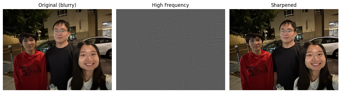
The results on a selfie of me are shown below:
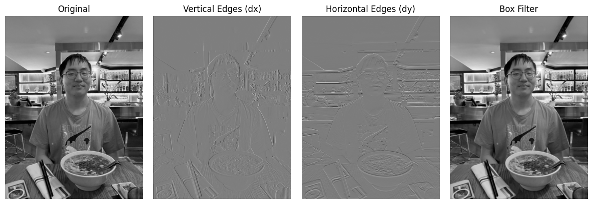
- Even though \(D_x\) contains an \(x\) in its expression, it does not track changes in the \(x\) values. Instead, it highlights sharp changes in the \(y\) values, detecting vertical edges.
- Conversely, \(D_y\) detects horizontal edges.
- The box filter looks almost identical to the original picture at first glance, but if you look closely, it is slightly blurrier. This is expected, since its formula is:
\[ B = \frac{1}{9} \begin{bmatrix} 1 & 1 & 1 \\ 1 & 1 & 1 \\ 1 & 1 & 1 \end{bmatrix} \]
Finite Difference Operator
Continuing from the previous section, we now apply the finite difference filters to the classic cameraman.png image. This will further validate our explanation above.
We also explore the effect of binarization. The threshold parameter 0 <= thresh <= 1 sets all values above the threshold to 1, and the rest to 0:
- A lower threshold → better-defined, thicker edges.
- Too low a threshold → introduces non-existent edges and noise.
For this example, we chose a threshold of 0.15.
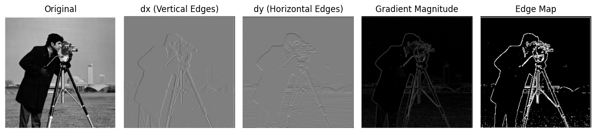
This again confirms our understanding of \(D_x\) (vertical edges) and \(D_y\) (horizontal edges).
Derivative of Gaussian (DoG) Filter
In the previous problems, the results were noisy and hard to interpret. Gaussian filters give us a cleaner approach.
The Gaussian function is defined as:
\[ G(x, y) = \frac{1}{2 \pi \sigma^2} \exp\Bigg(-\frac{x^2 + y^2}{2\sigma^2}\Bigg) \]
This looks intimidating, so here’s a discrete approximation that’s easier to visualize:
\[ G = \frac{1}{16} \begin{bmatrix} 1 & 2 & 1 \\ 2 & 4 & 2 \\ 1 & 2 & 1 \end{bmatrix} \]
We repeat the same filtering steps as before, but now on Gaussian-filtered images:
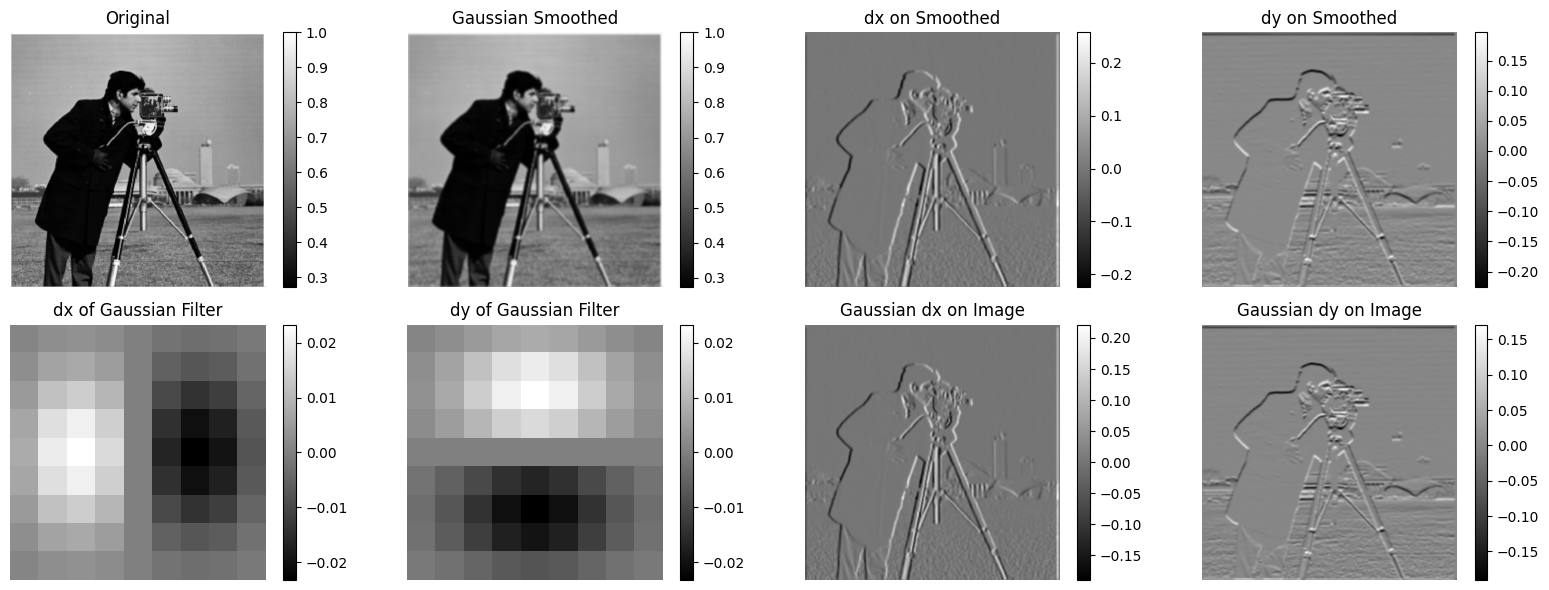
On the upper-left corner, we have the original photo and the Gaussian-smoothed version. It should be more apparent than with the box filter that this one slightly ‘alters’ the image by making it blurrier, since we are taking the average of the neighborhood values of each pixel.
On the upper-right corner, we have the \(D_x\) and \(D_y\) filters applied to the Gaussian-smoothed version of the image. There seems to be a noticeable difference! I personally think it extracts more details now than the previous version. If you look at the edges that these filters have captured, they have been enhanced and it is now much clearer which lines are actually edges.
On the bottom-left corner, we have \(D_x\) and \(D_y\) applied directly to the Gaussian filters, just to give a sense, in abstract terms, of what these operations do to the Gaussian filters (again, \(D_x\) emphasizes vertical lines, while \(D_y\) emphasizes horizontal lines—not surprising).
On the bottom-right corner, we have the \(D_x\) and \(D_y\) of the Gaussian filter applied to the image. Note that instead of applying the operations in a chain, we merged the two filters into one and applied it to the image. Interestingly, it looks exactly the same as the upper-right corner (because they are actually the same!).
Compared to finite differences, Gaussian smoothing preserves global structure but blurs edges, the DoG filter emphasizes edges while ignoring slow intensity variations, and finite differences provide sharper edge detection but lack scale sensitivity and robustness to noise.
Fun with Frequencies!
Image “Sharpening”
Sometimes in real life, we encounter blurry images. Sharpening can make them much clearer.
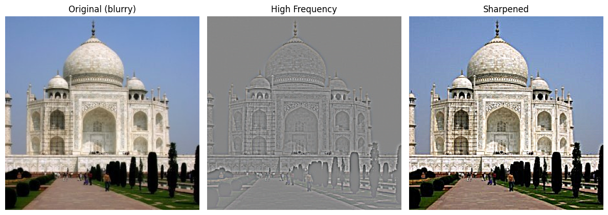
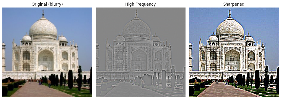
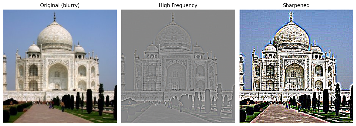
- Sharpening improves image clarity. For example, the walls of the buildings now show texture more clearly.
- This happens because sharpening extracts high-frequency details from the blurred image and adds them back.
- With a small \(\alpha\), the sharpening is subtle, producing a natural-looking enhancement.
- As \(\alpha\) increases, edges become more pronounced, but excessive values can lead to halos and unnatural artifacts around edges.
- This tradeoff illustrates that sharpening is a balance between improved detail and potential over-enhancement.
The formula for the unsharp mask filter is:
\[ I_{\text{sharp}} = I_{\text{original}} + \alpha \, (I_{\text{original}} - I_{\text{blurred}}) \]
Example 1: Motion Blur
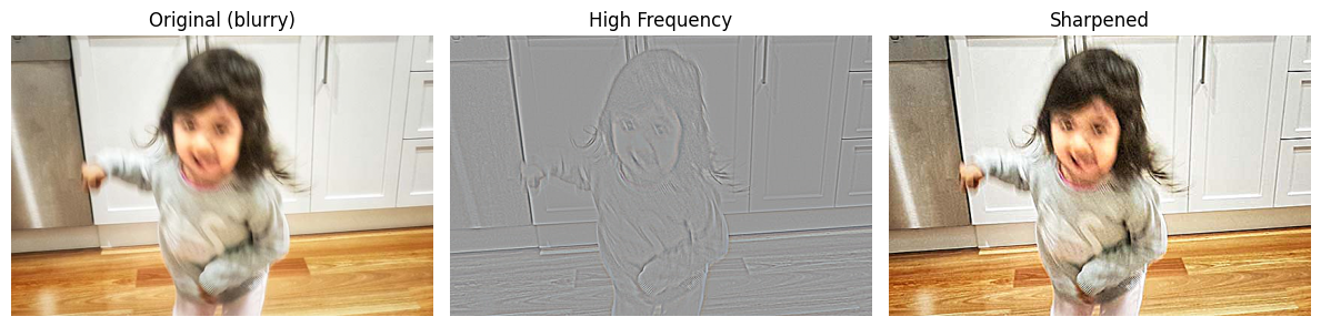
- The filter reduces blur, but cannot fully recover details lost to motion.
- Still, the child’s image is noticeably clearer.
Example 2: View Blur
- Compared to the original photo, the sharpened version brings out more structure and definition.
- While not perfect, the result is a significant improvement and highlights the effectiveness of the technique.
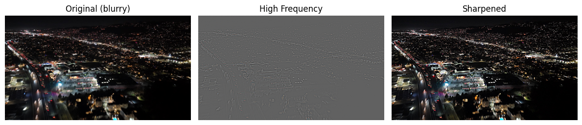
Example 3: Blurring → Sharpening
- Starting with a sharp image, blurring, then sharpening does not restore the original.
- Why? Because blurring destroys high-frequency information, which cannot be recovered later.
- The sharpened version is clearer than the blurred one, but still different from the original.
(Side note: my brother Kenny and I both look awkward here, lol.)
Hybrid Images
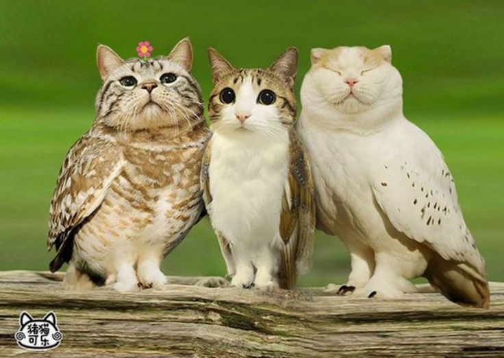
Of course, we can do more cool stuff. One thing I have always been intrigued by is some people’s ability to seamlessly piece two images together, creating something that looks both weird and natural—without Photoshop. An example would be a cat-owl. Of course, such a creature doesn’t exist in real life (or does it?), but thanks to skilled photo manipulation, one can place a cat’s head on an owl and make it look very realistic.
Back to the main topic, I am a UC Berkeley senior who has been studying computer science for quite some time now. When thinking about this, I considered some pairs of professors (who might have taught a class together, graduated around the same time, etc.). The following hybrid images are all about our wonderful professors (or former professors/lecturers). You might recognize all of them.
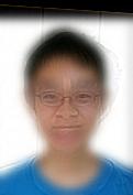
The first pair is (intensive drum beats)… Professor Efros and Professor Kanazawa! Of course, I had to model them first since I am taking their course!
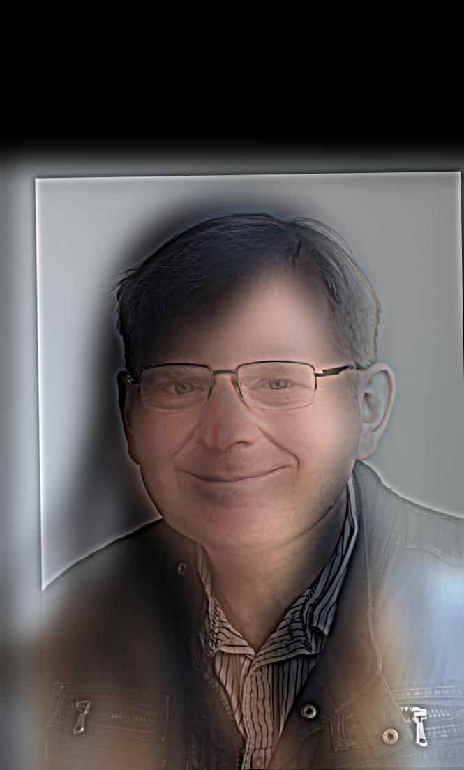
If you look closely, you’ll see our wonderful Professor Efros—it should be pretty obvious, especially considering how much time I spent getting the cut-off values just right.
The second pair of lectures that everyone should know—at least if you had your undergraduate education here—is:
This one is slightly less obvious. But if you look closely, Peyrin’s awkward smile in his profile picture should be somewhat apparent, while if you step a bit further back, Justin’s classic high school smile becomes visible again.
Last but not least, our CS61A GOAT with another classic professor:
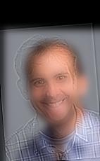
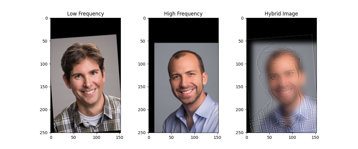
The reason I chose these two is that Professor DeNero’s smile is just too bright in this picture—it always sticks in my mind. Apparently, when I was looking at the list, Professor Gonzalez also has a very bright smile like Professor DeNero, which makes it perfect to hybridize these two images together.
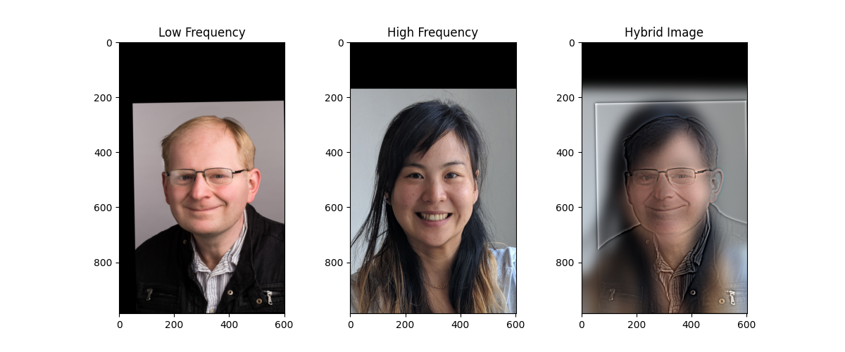
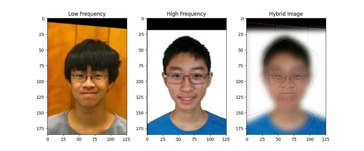
Hmmm…but how did we create all these images actually? Let’s look at it from a Fourier perspective. I personally like the first image, so thats what I will go with first:
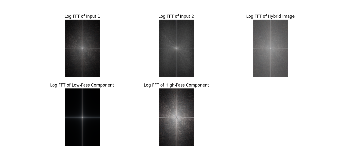
Input 1 is Professor Efros’ picture, while input 2 is Professor Kanazawa’s picture. At first glance, there’s not much to see from the original images, but once we apply low-pass and high-pass filtering, some interesting patterns emerge.
The low-pass filtered image primarily retains the light in the central area, while the high-pass filtered image spreads the light over a larger area. This makes sense: a low-pass filter preserves the low-frequency components of an image (the smooth, broad structures) and removes the high-frequency details, whereas a high-pass filter does the opposite, keeping edges and fine details while removing the smooth variations.
When we compute the resulting FFT of the image, we see a combination of these effects. The FFT shows the frequency content of the image: low-pass filtering suppresses the outer, high-frequency components in the frequency domain, while high-pass filtering emphasizes them. Combining these gives a frequency spectrum that reflects both the broad structure and the fine details of the original image, which explains the patterns we observe. In short, the low-pass captures the “general shape,” the high-pass captures the “details,” and their combination in the FFT naturally shows a mix of both.
Gaussian and Laplacian Stacks
In the previous project, we discussed how to use pyramids as a tool for image alignment for high-resolution images. In this project, we will borrow the same idea, but in a slightly different way. Instead of downsampling, we will make the image blurry while keeping it at the same size, so the result is a stack instead.
In fact, Burt and Adelson have a famous paper, A Multiresolution Spline With Application to Image Mosaics, that discusses this in detail. We will be recreating the results they achieved in 1983—that is, an oraple! (What’s an oraple? It’s a combination of orange + apple.)
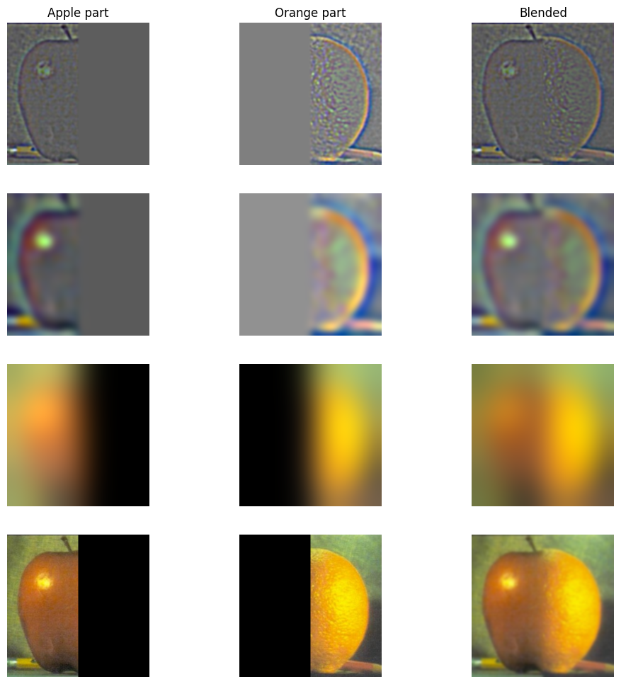
From top to bottom, we have the layers of the images after applying the binary mask for the orange and apple. One might say it’s just getting blurrier—and that’s true. But more importantly, because the images are being blurred using Gaussian and Laplacian stacks, we can merge the two fruits very nicely. The result looks pretty smooth, even though they are different fruits!
Multiresolution Blending (a.k.a. the oraple!)
We’ve already produced a satisfying result for the oraple—so why stop now?
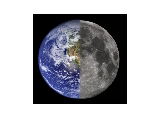
Thinking of oranges and apples, since Earth and the moon are all circular, why cannot we create a hybrid image of them?
The following figure is more advanced than just piecing two halves of the same picture together. I call it the Berkeley Snow:
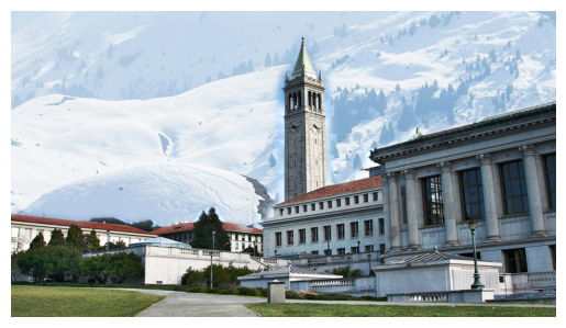
Although it hasn’t been snowing at Berkeley recently, I decided to recreate such a scene so Berkeley folks can have some fun playing with snowballs. Instead of just using a binary filter, we used the following filter:
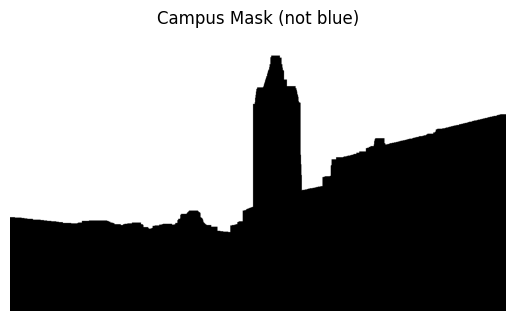
This filter was extracted from this picture:
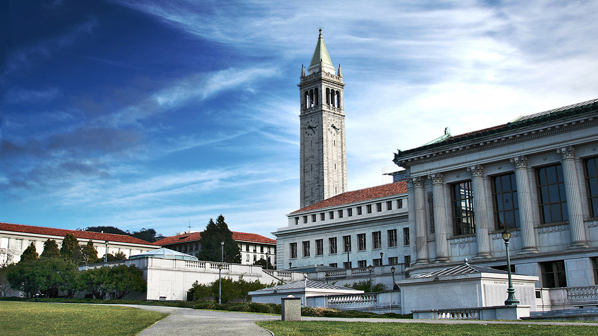
What a nice view! Observant viewers may notice that most of the sky here is blue or white. By using pixel values in HSV (converted from RGB) and applying some filtering to remove the blue and white sky, we already achieved a significant improvement.
However, the above approach alone is not enough to get a smooth-looking filter; in fact, the result is very choppy. To address this, I used a concept similar to momentum: instead of taking an exponential average, we take the maximum value in a pixel’s neighborhood to determine which parts should be black and which parts should be white.
More specifically, once my algorithm determines that, for a particular x-value, some y-value is the border between everything that is not the sky and the sky, it declares anything above that border as white and everything below as black, producing a new mask. This results in a cleaner, more structured mask.
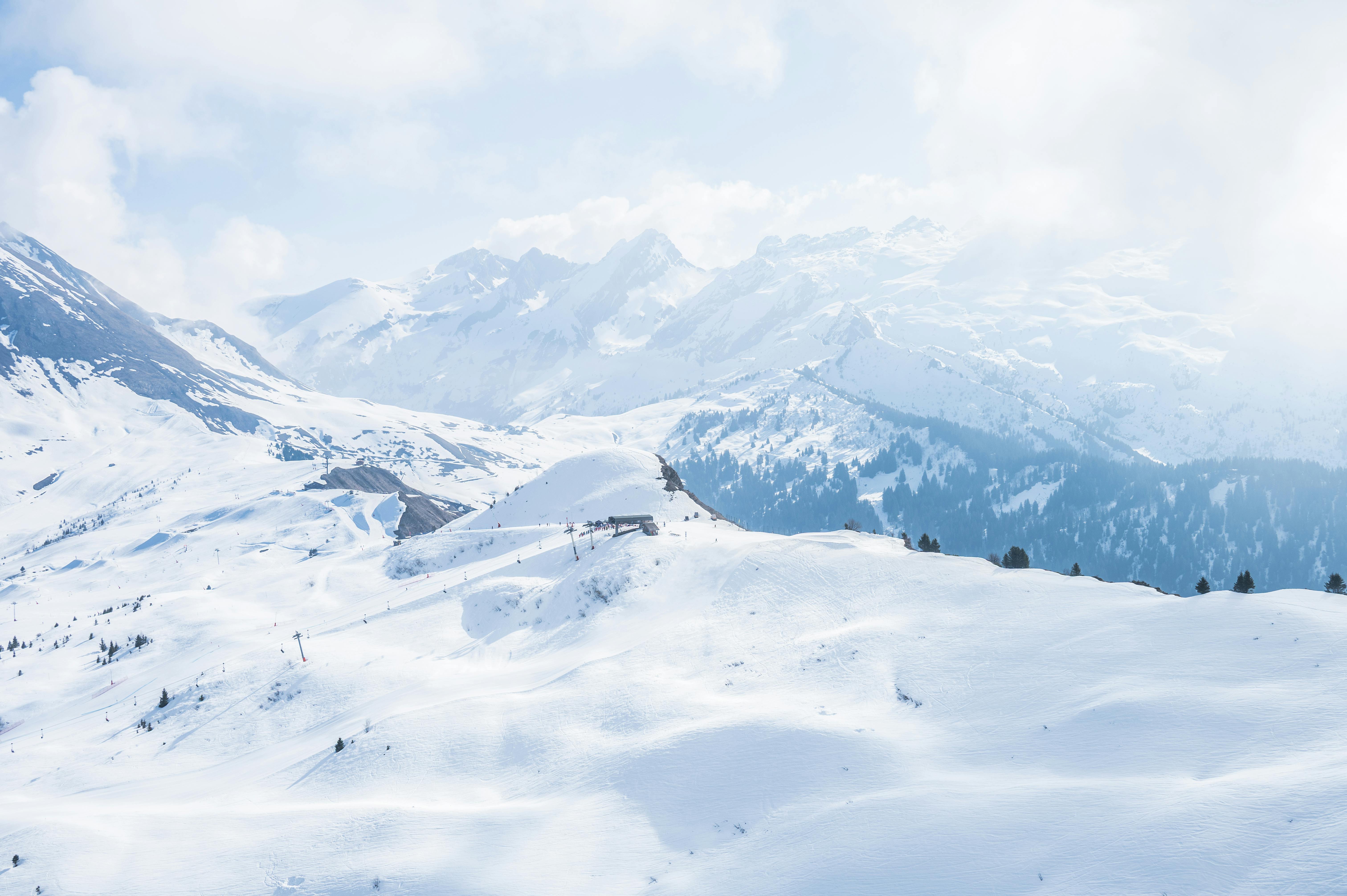
Now, here’s our nice weather view:
After some cropping, we can apply the mask along with Gaussian and Laplacian filters to get the final image! I am very satisfied with this work—especially after spending four hours figuring out how to get the cat-owl blend working.
Lessons
I used to think that the algorithms involved in creating images like these were probably something I would never attempt in my entire life—it all seemed like advanced Photoshop at first. After working on this project, I’ve gained a much deeper understanding of how code can achieve these effects, from image pyramids to filtering and blending techniques. I am genuinely impressed by how much progress I’ve made so far and how much control programming gives me over creating complex visual results.