Code
from datascience import *
import numpy as np| Name | Wesley Zheng |
| Pronouns | He/him/his |
| wzheng0302@berkeley.edu | |
| Discussion | Wednesdays, 12–2 PM @ Etcheverry 3105 |
| Office Hours | Tuesdays/Thursdays, 2–3 PM @ Warren Hall 101 |
Contact me by email at ease — I typically respond within a day or so!
from datascience import *
import numpy as npWhen calculating the correlation coefficient, why do we convert data to standard units?
We convert data to standard units in order to compare it with other data that may be of different units and scales. For example, if we wanted to compare the weights of cars (usually thousands of pounds) to the maximum speed of cars (usually tens of miles per hour), converting to standard units allows us to effectively compares the two variables.
Moreover, using standard units gives us the following nice properties:
Write a function called convert which takes in an array of elements called xs and returns an array of the values represented in standard units.
def convert(xs):
    sd = ______________________________
    mean = _____________________________
return ____________________________def convert(xs):
sd = np.std(xs)
mean = np.mean(xs)
return (xs - mean) / sdconvert(make_array(1, 2, 3, 4, 5, 6, 7))array([-1.5, -1. , -0.5, 0. , 0.5, 1. , 1.5])Write a function called correlation which takes in a table of data tbl containing the column names x and y and returns the correlation coefficient.
def correlation(tbl, x, y):
  x_su = ____________________________________
  y_su = ____________________________________
return ____________________________________def correlation(tbl, x, y):
x_su = convert(tbl.column(x))
y_su = convert(tbl.column(y))
return np.mean(x_su * y_su)correlation(Table().with_columns("x", make_array(1, 2, 3, 4, 5), "y", make_array(1, 3, 5, 7, 9)), "x", "y")0.99999999999999978Correlation Coefficient Visualizer!
Look at the following four datasets. Rank them in order from weakest correlation to strongest correlation.
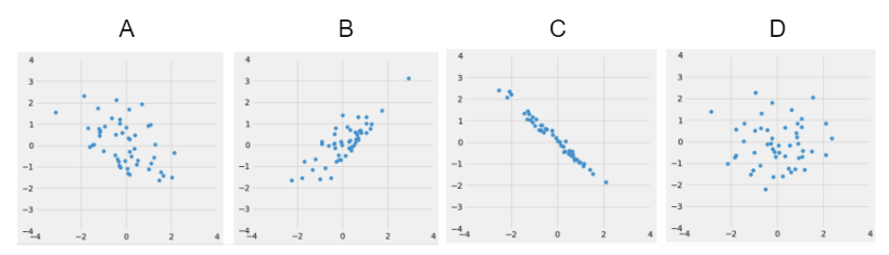
(Weakest) __________ __________ __________ __________ (Strongest)
D, A, B, C.
We have introduced correlation as a way of quantifying the strength and direction of a linear relationship between two variables. The correlation coefficient can allow us to define the best straight line that defines the relationship between the two variables, known as the regression line. In fact, by a remarkable fact in mathematics, the line uniquely defined by the slope and intercept below is always the best possible straight line we could construct.
\[ \text{slope} = r \cdot \frac{\text{SD}_{y}}{\text{SD}_{x}} \]
\[ \text{intercept} = \text{average of } y - \text{slope} \cdot \text{average of } x \]
Regression Line:
\[ \hat{y} = \text{slope} \cdot x + \text{intercept} \]
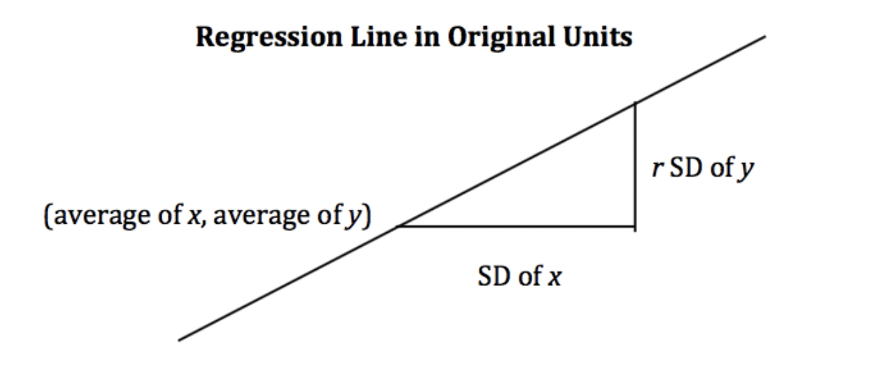
For every 1 SD increase in \(x\), the predicted value of \(y\) increases by \(r\) SDs of \(y\).
Derive the slope and intercept above using the equation for the regression line in standard units (\(y_{\text{SU}}\) represents \(y\) in standard units).
You just submitted a ticket at Office Hours and would like to know how long it will take to receive help. However, you don’t believe the estimated wait time displayed on the queue to be very accurate, so you decide to make your own predictions based on the total number of students present at OH when you submitted your ticket. You obtain data for 100 wait times and plot them below, also fitting a regression line to the data.
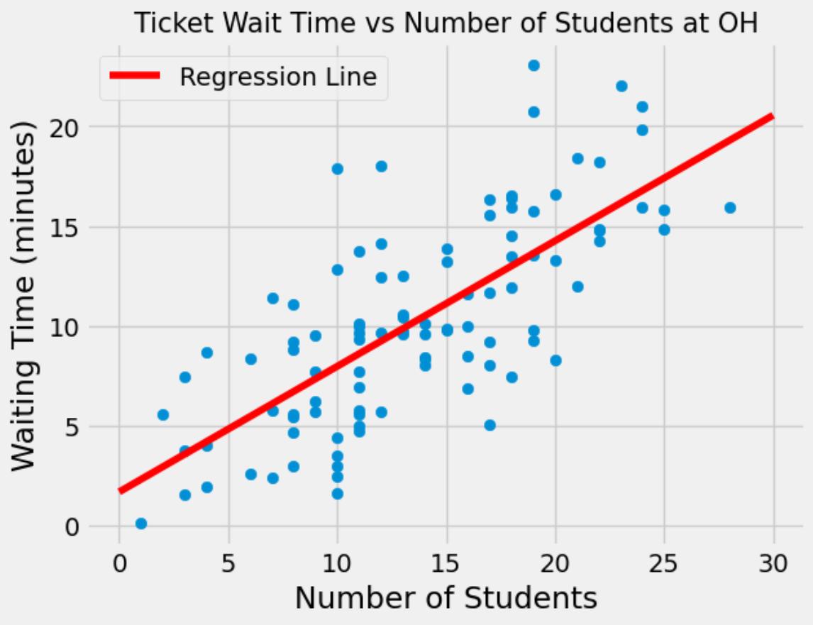
Suppose that you submit a ticket at Office Hours when there were a total of 20 students present. Based on the regression line, what would you predict the waiting time to be?
You go to Office Hours right before a homework assignment is due, and despite safety concerns, you observe 70 students at Office Hours. Would it be appropriate to use your regression line to predict the waiting time? Explain.
It would not be appropriate to use the regression line to make a prediction. Most values that were used to construct the regression line were between \(x=0\) and \(x=25\). Since \(x=70\) is far out of that range, we cannot expect the regression line to make a very accurate prediction. Furthermore, since we don’t have data for \(x > 30\), we are not sure that the linear trend continues for larger values of \(x\).
When constructing your regression line, you find the correlation coefficient \(r\) to be roughly 0.73. Does this value of \(r\) suggest that an increase in the number of students at Office Hours causes an increase in the waiting time? Explain.
Correlation does not imply causation! Just looking at the data it is unclear whether we account for confounding factors, and how they might contribute to the overall waiting time. For example, it is definitely possible that varying difficulties in the assignments across tickets affects the overall waiting time.
Suppose you never generated the scatter plot at the beginning of this section. Knowing only that the value of \(r\) is roughly 0.73, can you assume that the two variables have a linear association? Circle the correct statement and explain.
(This question uses the same data as Question 3 on the Summer 2024 Final Exam)
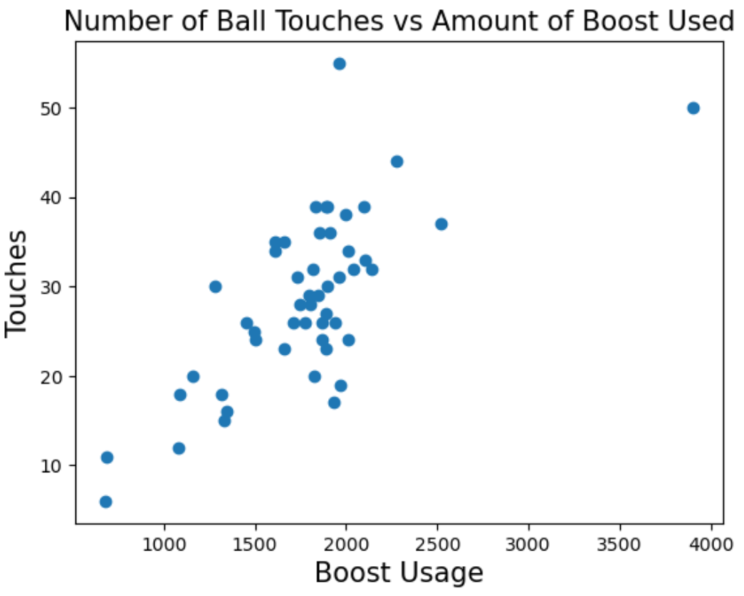
Conan has an unhealthy addiction to Rocket League, a game where players play soccer but with cars instead of people. Players can pick up boost pads that are scattered across the field, which players can use to make their cars go faster! Conan plays 50 games and records how much boost he used, as well as how many times he touched the ball in a given game.
Select the correct option:
Select the correct option:
Conan runs some calculations and obtains the following statistics:
For the following questions, feel free to leave your answers as mathematical expressions.
Conan touched the ball 40 times in one of his games. What is this in standard units?
Conan wishes to fit a regression line to the data. What would be the slope and intercept of the regression line in original units?
\(\text{slope} = r*\frac{\text{SD of touches}}{\text{SD of boost usage}} = 0.705 * \frac{9.51}{471.7} \approx 0.0142\)
\(\text{intercept} = \text{average of touches} - \text{slope * average of boost usage} = 28.54 - 0.0142*1773.4 \approx 3.36\)What would the slope and intercept be if the data were in standard units?
\(\text{slope} = r*\frac{\text{SD of touches (SU)}}{\text{SD of boost usage (SU)}} = 0.705*\frac{1}{1} = 0.705\)
\(\text{intercept} = \text{average of touches (SU) - slope * average of boost usage (SU)} = 0 - 0.705*0 = 0\)
When in standard units, the slope of the regression line is just \(r\), and the intercept is always zero.